Project Description
WinterCast
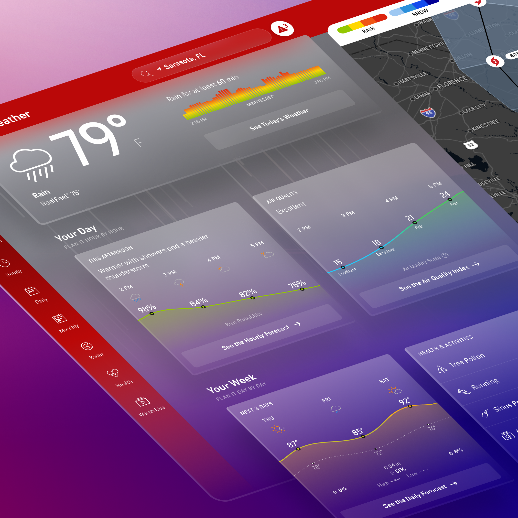
Know how much snow and ice to expect – and when. WinterCast helps users prepare for winter weather by providing helpful snow and ice data visualizations and maps to help stay ahead of inclement weather

THE GOAL
The goal of WinterCast is to provide users with the most comprehensive winter weather experience and to help them prepare for incoming snow and ice conditions that will impact their location. Users can easily access WinterCast through the core weather experience whenever any snow or ice is predicted for the users current location.
THE OUTCOME
WinterCast has become a reliable tool for users who live in areas where winter weather has negative impacts on travel and plans. Users can easily plan ahead through WinterCast alerts, visualizations, and winter map layers.
KPI’S
Audience engagement: Increasing screen views per session and screens views per user through contextual data and maps.
- Add a 24 hour past snow accumulation map
- changes to the 24 hour snow forecast map
Audience Growth: Increase total number of WinterCast screen views from customers impacted by a Winter weather event
- add a new fifth navigation entry point
- adding ice forecasts in WinterCast
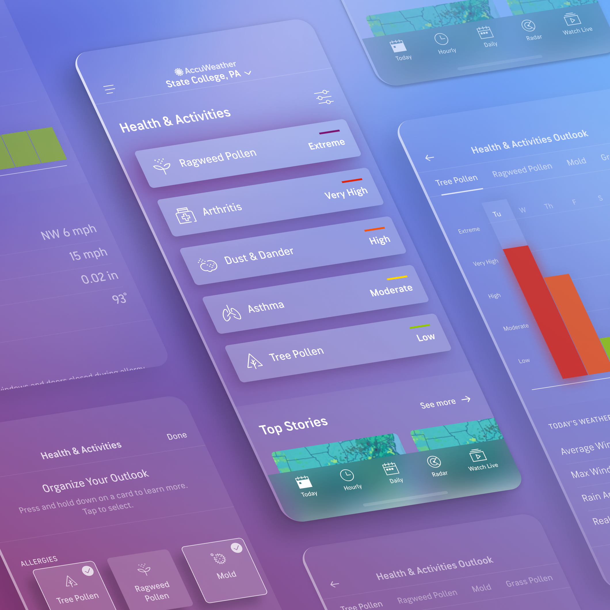
Audience Retention: Increasing the number of repeat users in WinterCast through contextual push notifications
- Add WinterCast alerts
PROJECT DETAILS
Company: AccuWeather
My Role: UX + Lead Visual Designer
Platform: iOS, Android, Web
Team: UX, Product, Engineers, Meteorology
Programs: Figma (Design + Prototyping)

THE PROBLEM
• Originally only focused on snowfall, leaving a void of a true comprehensive outlook
• Only showed one storm at a time, eventhough multiple storms were forecasted
• Snowfall map was not robust or intuitive
• Charts were not interactive and only showed one snow event
THE SOLUTION
• WinterCast made readily available by covering all snow and ice events in 5-day period
• Display both snow and ice probabilities
• Implement interactive snow, ice and temperature graphs for high level view of intensity
• Expansion of maps to show snow plots
• Create module on other pages to get users into WinterCast
Usability Test
CONCEPTS TESTED

OBJECTIVE
Determine which “hero” will be most useful for users in the WinterCast experience
APPROACH
- 60 participants,18-55
- Located within the US who experience snowfall as part of their daily life
- Tested three different “hero” options, with their journey starting on the Today screen’s WinterCast CTA
FINDINGS
Usefulness (out of 5)
- Daily Graph (Option 1) 4.4
- Map (Option 2) 2.5
- Probabilities Chart (Option 3) 4.2
Direction Preference
- Daily Graph (Option 1) 40%
- Map (Option 2) 3.3%
- Probabilities Chart (Option 3) 57%
Most participants had a hard time choosing between Option 1 and 2, understanding the pros and cons for each. While the daily graph is seen as slightly more useful, it appears that the probabilities chart might be preferred because it draws more attention to the upcoming storm, which might be more important than planning beyond the event.
Daily graph hero (Option 1)
- The bars align to the concept of a snow pile, making it feel very intuitive
- Looking across days is better for looking ahead and planning
- Including numbers over each graph will help make the graph even easier to interpret
- Shows the expected snowfall amount very clearly (large datapoint)
- Better for more immediate/impactful snowfall
Probabilities hero (Option 3)
- Gives valuable details with probabilities and clear time frame
- Seems more “honest” in showing multiple probabilities
Map hero (Option 2)
- Not enough information (no snowfall amounts)
- May appear more useful if the day-by-day controls were visible without having to enter “full screen” mode.
- Some participants were still open to having a map at the top of the screen if it was more useful
Visual Design
WINTERCAST LANDING
Snow amounts with hourly and total accumulation charts

PROBABILITIES
Snow and ice probability charts

STORM LIST
Storm list provides active and upcoming storms

Frame 174
MAPS

INTRODUCING ICE
Users can access active and upcoming ice storms

ENTRY POINT + STORM LIST
Today page banner and conditional 5th tab entry points into active and upcoming snow and ice events