Project Description
Hurricane Tracker
Providing users with a real-time understanding of all the factors related to hurricanes and tropical storms as they approach landfall.
The Problem
Through analysis of the very limited tropical features on the app, it became apparent the biggest challenge was that there was no clear indicator that a hurricane was happening. There wasn’t an entry point to access vital hurricane information anywhere on the core weather pages of the app. In addition, the hurricane experience didn’t present the crucial information users needed to be proactive, prepare and take action.
Users living in a location that is commonly impacted by hurricanes and tropical storms had little way of knowing the storms status, forecasted impacts, or severity.
The Goal
The UX should provide users with the most comprehensive hurricane information to help increase awareness of incoming hurricanes and their impacts. This experience should be created to keep people safer during hurricanes and tropical storms, by providing them with the awareness and capabilities to track tropical storms as they develop and make landfall. The data should be easy to digest and easy to access. Entry points should be easy to find and alert users when a storm is approaching. The business goal is to introduce a new line of revenue by adding new pages, features and subscription upsells.
The Result
The Hurricane Tracker aligns perfectly with AccuWeather’s mission to “Save Lives and Protect Property”, while receiving positive reviews from users – such as “excellent,” “easy to understand,” and “an outstanding service provided.”
We delivered an innovative product that allows users to easily understand storm data and to be aware of storm impacts by creating a localized experience with an insights into the storms path, rain amounts, and wind speeds. It sets us apart from competitors.
The new product increased ad revenue during the tropical storm season and increased user engagement. This was the result of the entry points allowing easy access to the storm pages. The engagement and sessions increased through the interactive hurricane map, graphs, and real time updates.
Opened new opportunities to promote this product across out pages and platforms.
PROJECT DETAILS
Company: AccuWeather
My Role: UX + Lead Visual Designer
Platform: iOS, Android, Web
Team: UX, Product, Engineers, Meteorology
Programs: Figma (Design + Prototyping)
Research + Strategy
Looking at the previous experience
While taking a deep dive into the previous experience, we (product and design) uncovered many opportunities for improvements and enhancements. Some of the improvements were around visibility and the overall user flow. For instance, users only had access vital hurricane updates and data by opening a specific tropical map layer on the radar page. There was no obvious communication or entry points within the app if an active or incoming hurricane was present. After this discovery, awareness and visibility was the top priority.
There also wasn’t a localized experience, so to align more closely with our hyper-local forecasting philosophy, we created a new local hurricane tracking experience to help enhance our products, provide tremendous value to our users, and really set us apart from other weather apps.

KEY TAKEAWAYS
Create a strong alert based experience around incoming and active hurricanes
Design a localized hurricane experience to allow users to fully understand the impacts of their location
Provide real-time data visualizations around rain amounts and wind speeds
Integrate featured stories and live updates to help build awareness and educate users of hurricanes around the globe
Create a fully interactive hurricane tracker map so users can follow the storm paths
Build out a robust library of tropical storm maps around risk to life and property, rainfall, wind, and storm surge
Explorations
Established new entry points to the hurricane experience
THE PROBLEM
Users couldn’t find vital hurricane and tropical storm information quickly or easily. There was little way of knowing the impacts or severity of the storm.
THE SOLUTION
I created a brand new tab in the navigation that would trigger when a tropical storm or hurricane was present. Also, optimized the alert banners to show approaching storms that may impact the users current location. These entry points would take the user to a storm list that would display all local and active storms. This allowed the user to prioritize action and enter the hurricane detail page to learn more.
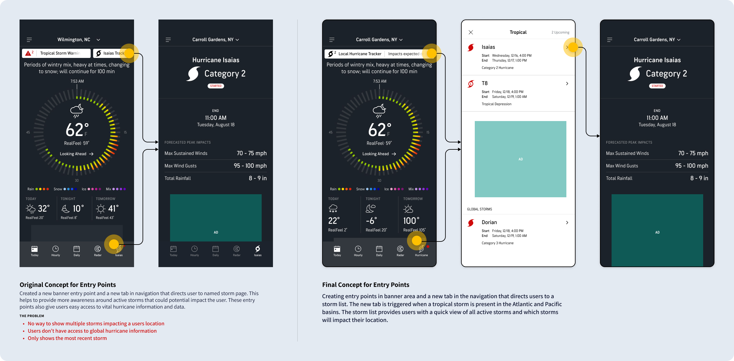
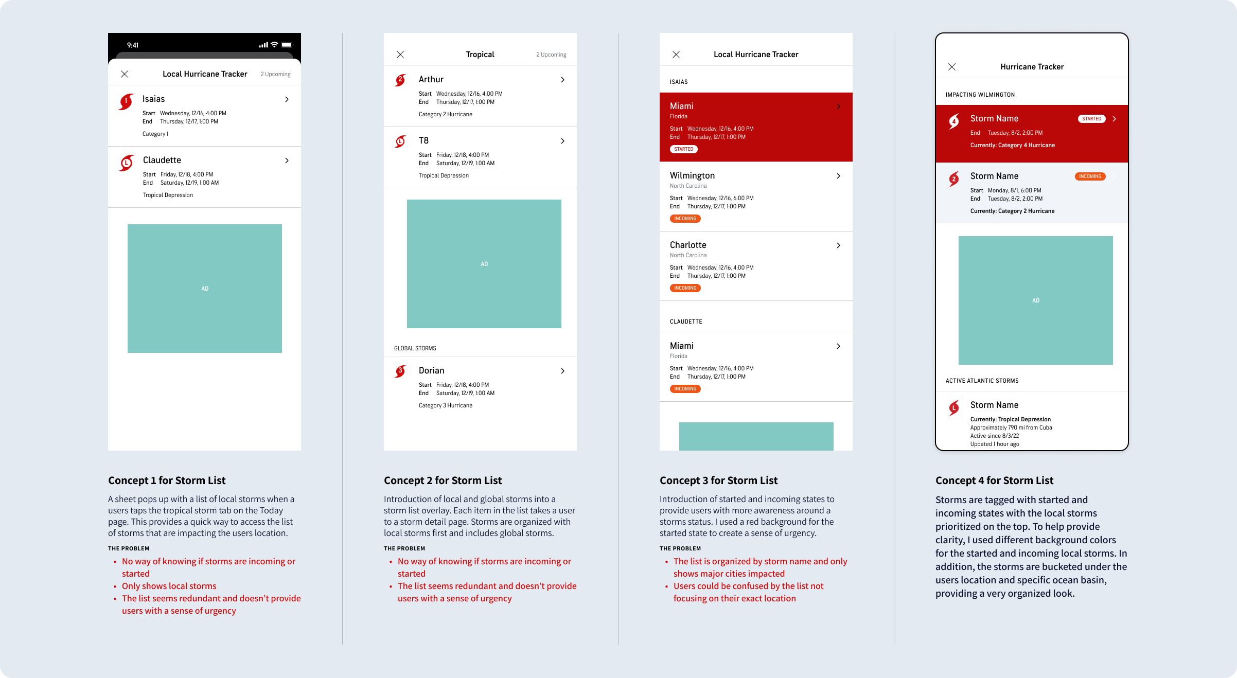
Creation of a new storm list page
THE PROBLEM
Users didn’t have a way to view multiple active storms. We needed to find a way to create an aggregated list of all tropical storm activity to make this experience as helpful and actionable as possible.
THE SOLUTION
I created a new storm list page where storms are tagged with started and incoming states with the local storms prioritized on the top. To help provide clarity, I used different background colors for the started and incoming local storms. In addition, the storms are bucketed under the users location and specific ocean basin, providing a very organized look.
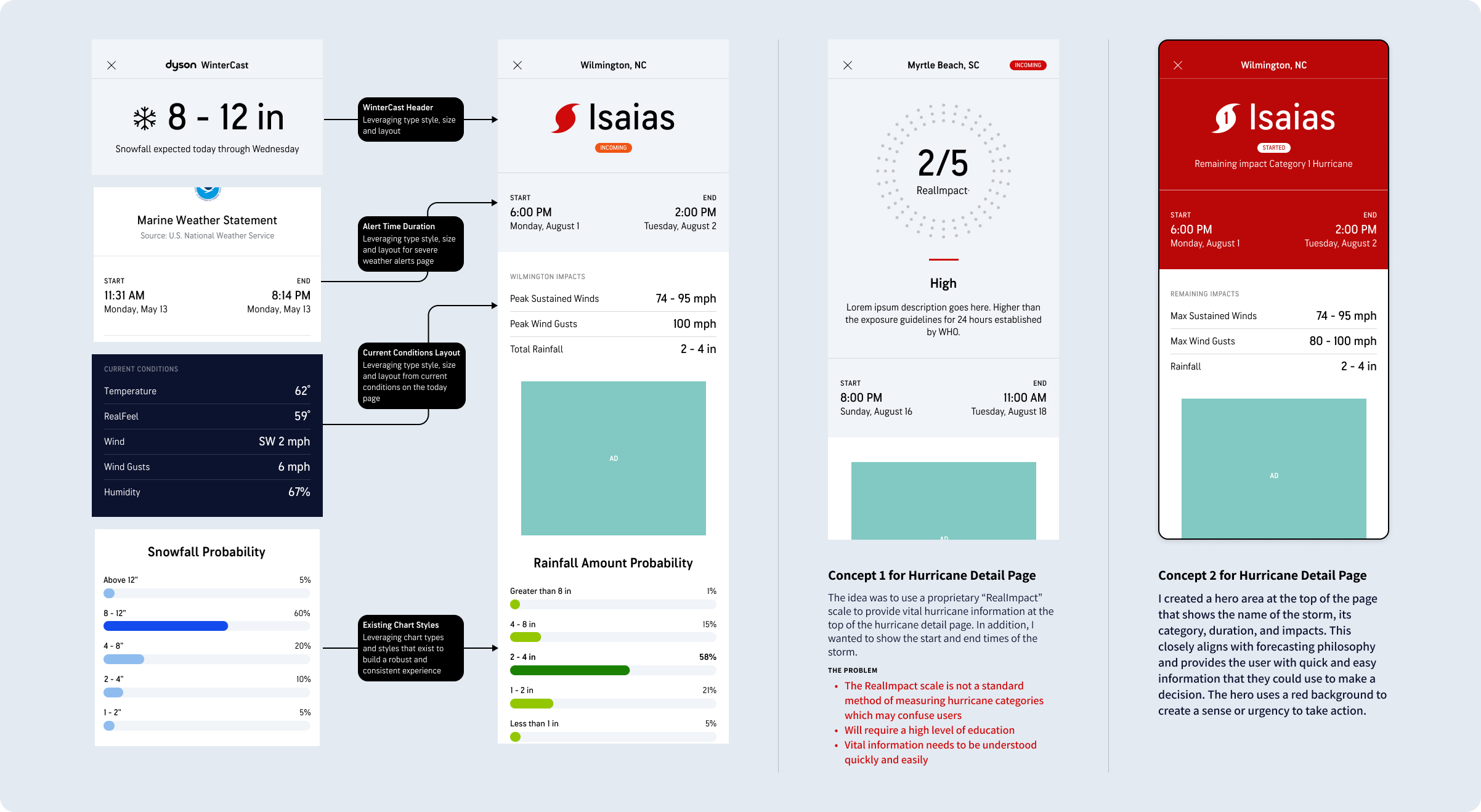
Creation of a new hurricane detail page
THE PROBLEM
There wasn’t an easy way to display the hurricane information so it is easily understood. We needed to leverage forecasting philosophy and user testing to establish an excellent information architecture and hierarchy of data.
THE SOLUTION
I created a hero area at the top of the page that shows the name of the storm, its category, duration, and impacts. This closely aligns with forecasting philosophy and provides the user with quick and easy information that they could use to make a decision. The hero uses a red background to create a sense or urgency to take action. In addition, I utilized information from the database to create new graphs to display important rain and wind information.
User Test
KEY OBJECTIVES
- Ensure users can easily discover and navigate to the local hurricane experience
- Validate all the information in the local hurricane experience is easy to find and understand
- Identify any information, data, or features that may be missing
APPROACH
- Test the typical scenario where there is only one incoming hurricane
- Show a prototype, including the today and hurricane tracker screen
- A series of tasks to validate ease of use
- A series of questions to uncover any preferences/opportunities for improvements
FINDINGS
- Overall, users really enjoyed the layout and information the experience gave them
- The eye-path map in particular was seen as a vital component, and a few participants mentioned they wanted to see it at the top of the screen, and in some cases having animation
- The charts were also received well, and participants liked the toggle between views
- In describing the experience, they were complimentary and used words such as: “useful”, “comprehensive” and “clear”
FEEDBACK + IMPROVEMENTS MADE
- Include a timestamp on the eye path map
- Moved the eye path map higher up the screen, as participants saw this as the essence of the tracker, and it’s what they expected to see.
- Moving this up might also help provide more context for the category number in the icon and help educate users.
- Create a 1:1 experience with the AccuWeather website for consistency
- Interactive forecast eyepath map that users can utilize to follow the storm path and its plotted impacts along the way
Iterations from usability test
Final Visual Designs

Entry

Storm List

Hurricane Page

Hurricane Map

Live Blog