Project Description
Hourly Forecast
Make every hour count – with hourly forecast graphs. Providing our users with the ability to see specific forecast details visualized by the hour.
The Problem
The hourly page was a vertical list view of temperatures which made it difficult for users to understand what the hour-by-hour trends are for all forecasted data points such as temperature, precipitation, air quality, UV index, wind, and humidity.
With the launch of a new Premium+ subscription tier, I needed to create a more robust and valuable hourly experience to help grow the subscription audience of the business.
The Goal
Upsell users into a new Premium+ experience to help grow subscribers.
Create a highly visual and interactive way for free and paid users to consume hourly weather data while providing additional forecast information. Enrich the overall experience to help drive engagement and subscribers, while not taking anything away.
My Role
I worked with UX to brainstorm, design, and prototype various approaches to user test to help narrow down the concepts and interactions that worked best
Facilitated internal design reviews, product reviews, and stakeholder reviews for feedback and approvals under tight timelines
Integrated Premium+ upsells into the hourly forecast to help boost subscriptions
Designed a more robust experience using interactive graphs around all weather data points and integrating weather alerts
Provided Design QA during development to ensure the feature was pixel perfection for production
The Result
Mobile subscription gross revenue increased from $150k monthly to a peak of $1.1m monthly
Record high traffic to subscription upsell landing page compared to all other upsell entries combined
Two record breaking days for subscriptions the same month the hourly page was launched
Exceeded monthly subscription/revenue goals by 25%
PROJECT DETAILS
Company: AccuWeather
My Role: UX + Lead Visual Designer
Platform: iOS + Android
Team: UX, Product, Engineers, Meteorology
Programs: Figma (Design + Prototyping)
Research + Strategy
COMPETITOR ANALYSIS
Most of our weather app competitors either had a standalone graph view or list view to display hourly weather data.
Both of these views had pros and cons:
- The graph views provided a quick overview of the forecast of an entire day, but is harder to gauge the specific details of each hour
- The list view had details for each specific hour, but lacked the quick, scannable experience of an entire day
Because of the strengths of both styles of data visualization, both views are necessary for a more robust hourly experience. This provided an opportunity to set the AccuWeather app apart from competitors.

ANALYSIS OF PREVIOUS EXPERIENCE
The previous hourly page made it difficult for our users to understand what the hour by hour trends are for data points like temperature, precipitation, UV index, wind, and air quality.
Hypothesis is users want a birds eye view of their day and don’t want to have to drill into individual hours to find out what they want to know. The preferred method is to know hourly trends for single data point in a single view, so that they can plan and make the best decisions for their day.

KEY TAKEAWAYS
Design for all conditions/data points and narrow the offering down during shaping if needed
Incorporate personas in our feedback loop to make sure we’re solving for the most common user types
Basic data points for free always – Temperature, RealFeel, and Precipitation
Include alerts, sunrise and sunset, in addition to all weather data
Explorations
Establishing new data sets and figuring out how the current list view can live with the new graph view
Explored various concepts around implementing a new graph view that will live with the existing list view. The hope was to not take anything away from the user, while providing a new way to view their hourly forecast and additional data points by using a graph. From a business perspective, this would align us with competitors and provide additional value for a Premium tier upsell.
THE PROBLEM
Having the existing list view and the new graph view on the same page could seem repetitive as it is essentially providing the same data, just in a different format.

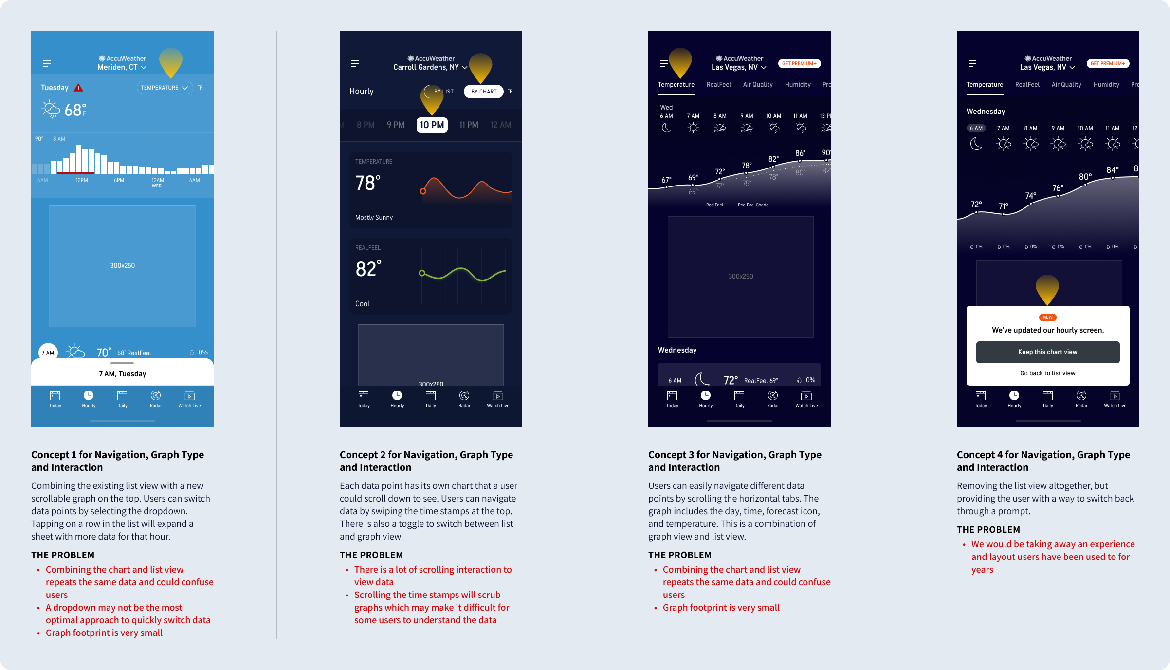
Iterating on the initial concepts to land on a specific direction
I took specific interactions and patterns from the initial concepts that would provide the best experience. These included the List/Graph toggle to allow users to switch between view, the scrollable line chart layout, and the scrollable tabs to display different forecast types such as precipitation, air quality, etc.
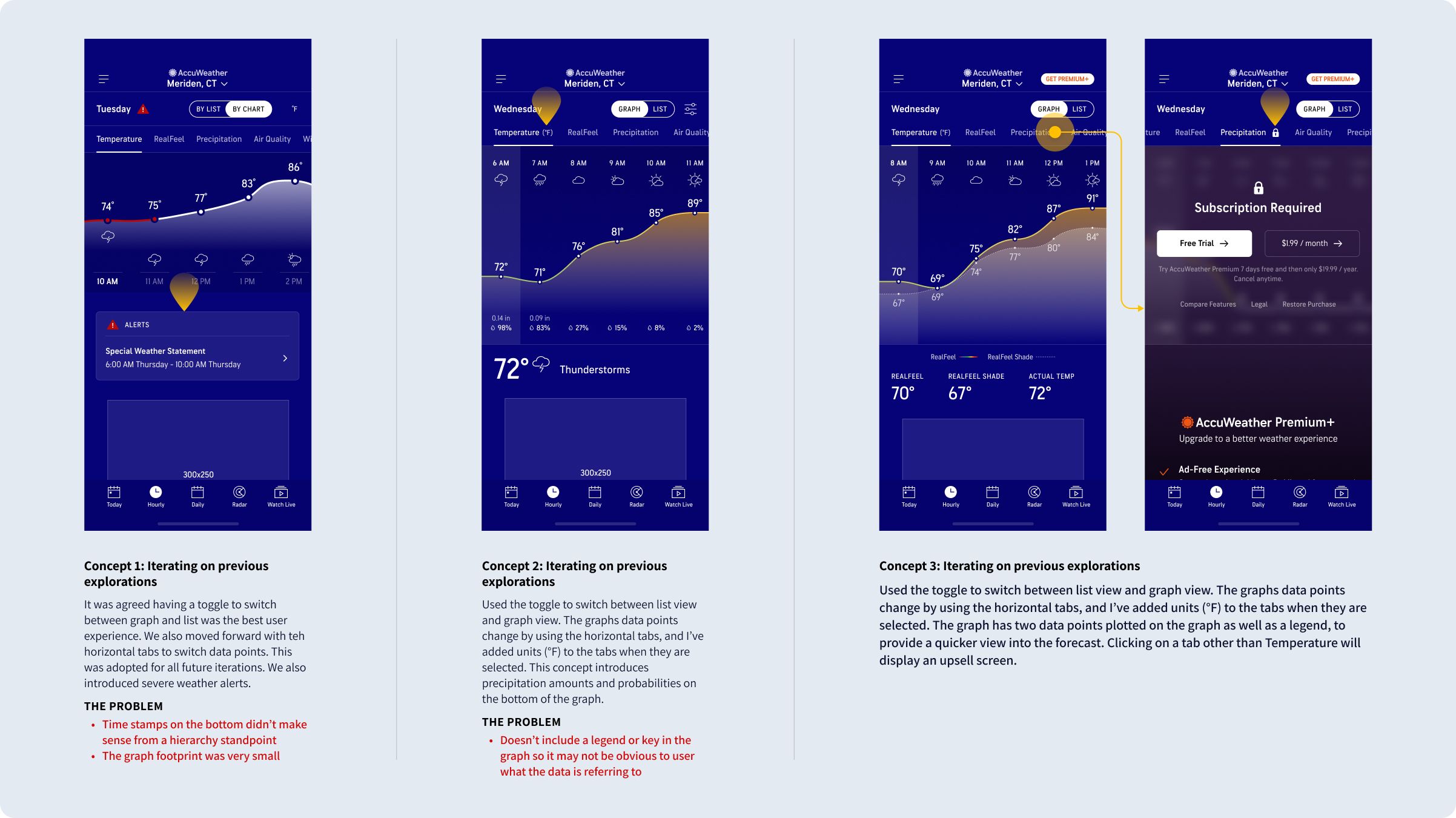
Implementing the upsells for the premium tier
I strategized the best ways to display upsells within the new graph experience to increase subscriptions, while ensuring these placements would not be intrusive or negatively impact the user experience. I also needed to decide which data points or forecast information will be provided free to the user, as well as how many hours of the hourly temperature forecast.
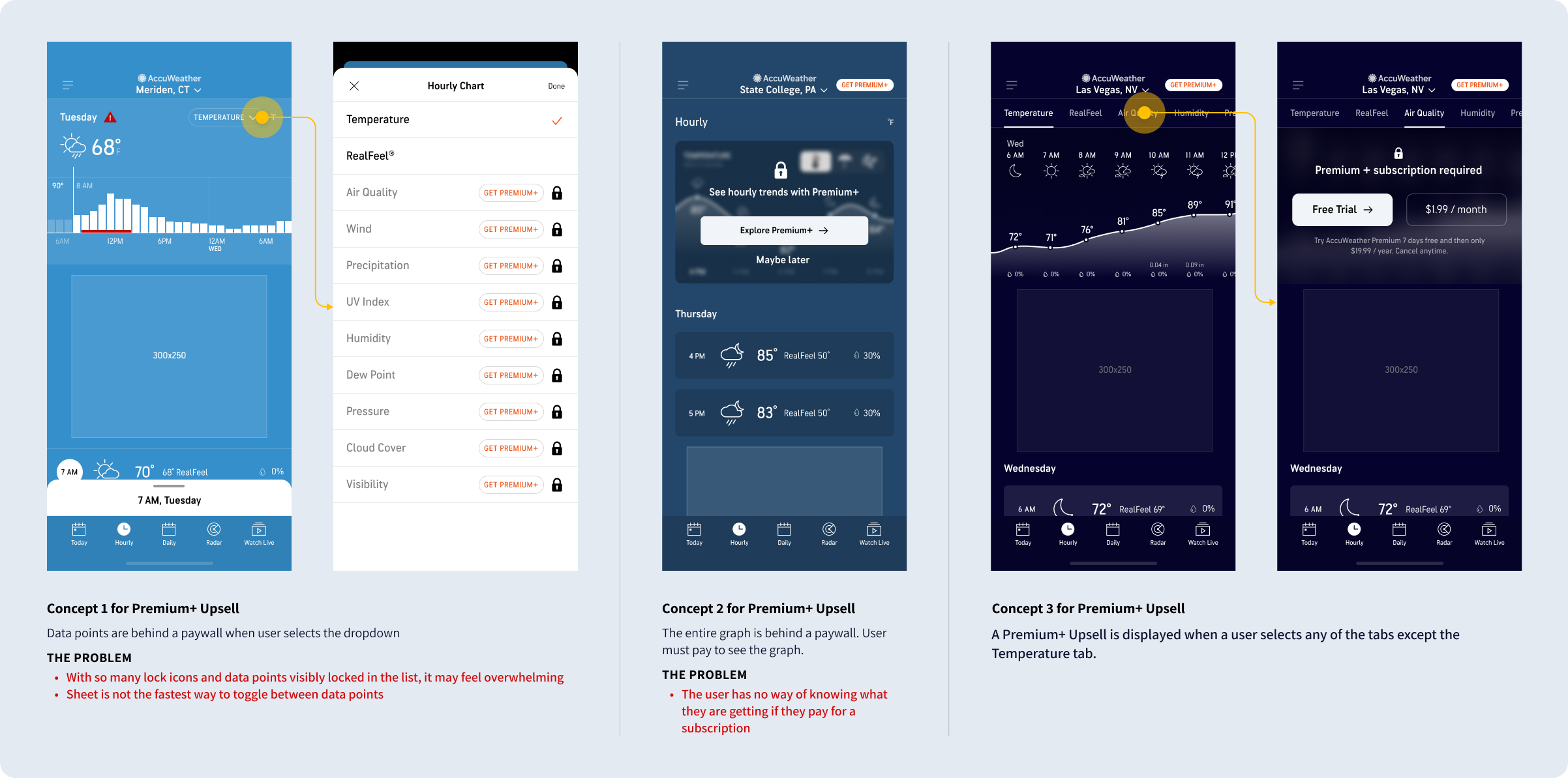
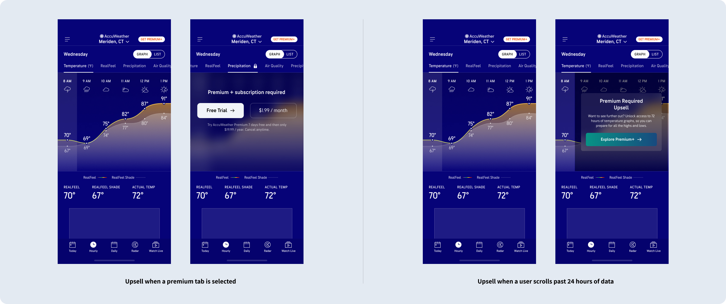
Iteration of upsell concepts
I created upsells inline with the graph that would display after the user scrolls past 24 hours of temperature. This would allow users to get a feel for the new graph view and understand its value. In addition, all data, except the Temperature data, was put behind a paywall to allow our premium users to access exclusive forecast data to help plan their day and week.
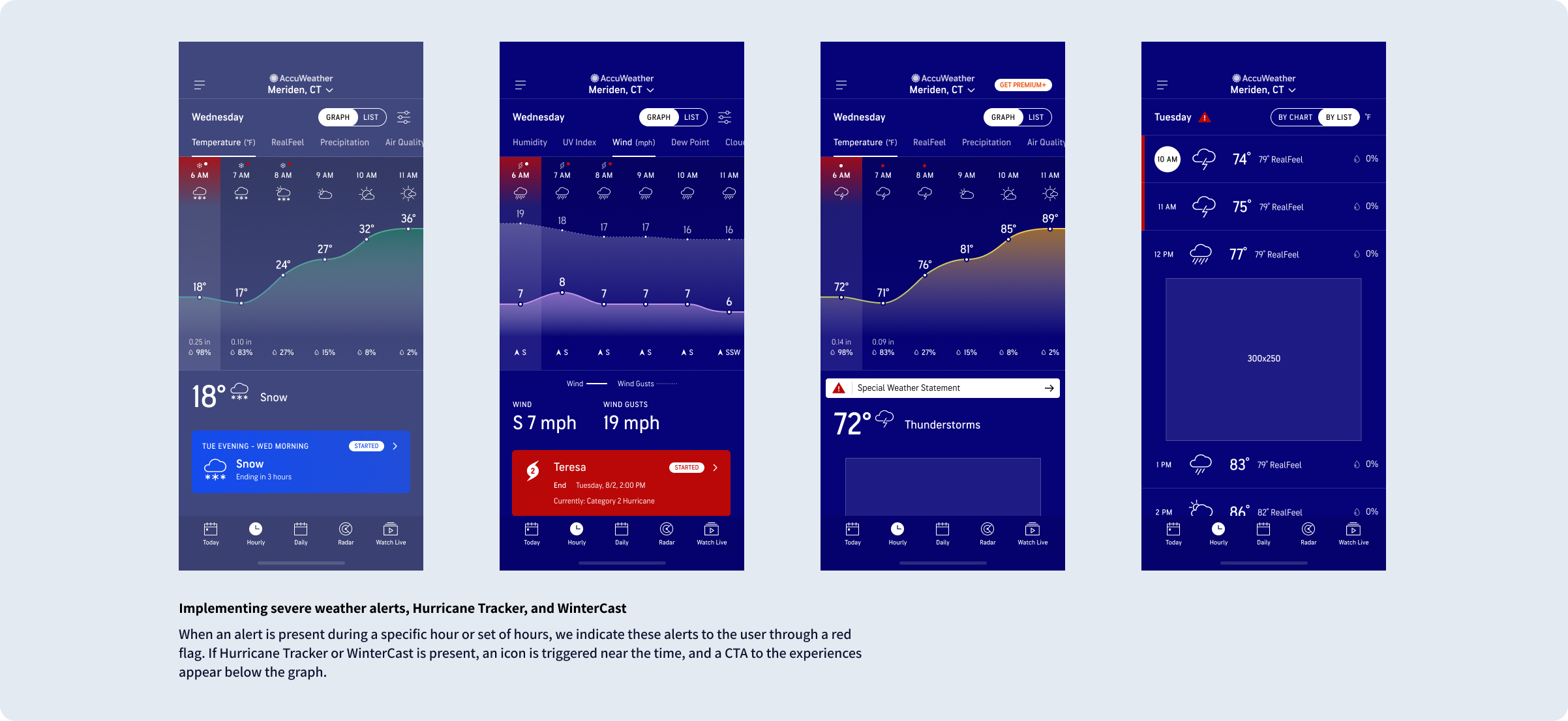
Integrating severe weather alerts
I integrated severe weather alerts, Hurricane Tracker, and WinterCast into the new hourly experience. This would highlight specific hours impacted by severe weather and provide users with an easy way to access other features within the app to track storms and take action to stay safe.
Usability Test
After multiple rounds of design reviews with Product, Meteorology, and Development, I created a working prototype for free and paid tiers to validate the usability and desirability for the new graph experience.
APPROACH
- Observe users’ interactions with the redesigned Hourly experience and identify any usability issues
- 20 unmoderated tests via PlaybookUX
- 1 prototype (consisting of both free AND premium version of the hourly experience)
- Participants recruited from PlaybookUX platform and screened for those who visited weather apps at least once in the past 30 days
- Participants were of mixed age, gender, and incomes.
POSITIVE INSIGHTS
- Roughly 3 out of 4 people interacted with the prototype as it was intended, without being prompted
- 60% checked out other tabs, seeing the upselling CTA on those premium tabs
- Participants liked the Graph view for its clear visual presentation as well as the amount of information shown at a glance
OBSERVATIONS
- 75% of the participants went to the Graph view, unprompted
- While on the Graph view, 70% interacted with the Temp graph by dragging horizontally, unprompted
- While on the Graph view, 70% scrolled vertically past the ad
- While on the Graph view, 60% checked out other tabs, seeing the upselling CTA on those premium tabs
- After seeing the premium version of the Graph view, 70% of the participants said they found the Graph view more useful (meaning, the premium Graph experience converted 2 people to prefer the Graph view to the List view)
- Some elements/interactions were overlooked – Only 55% saw the upselling CTA at the end of the free Temp graph and only 30% tapped on a specific hour and saw the Hourly sheet
POST TEST DESIGN REVISIONS
- Add more vertical spacing between the legend and the graph so that the legend doesn’t get lost
- Make the day info (“Wednesday”, “Thursday”) on the Graph view sticky when scrolling
- Update the Graph view guide to be a 2-step guide (1. Slide to see more hours, 2. Tap on each hour to learn more)
- Display the unit for the highlighted hour
- Include index information on some premium graphs (Air Quality, UV index)
Final Visual Designs

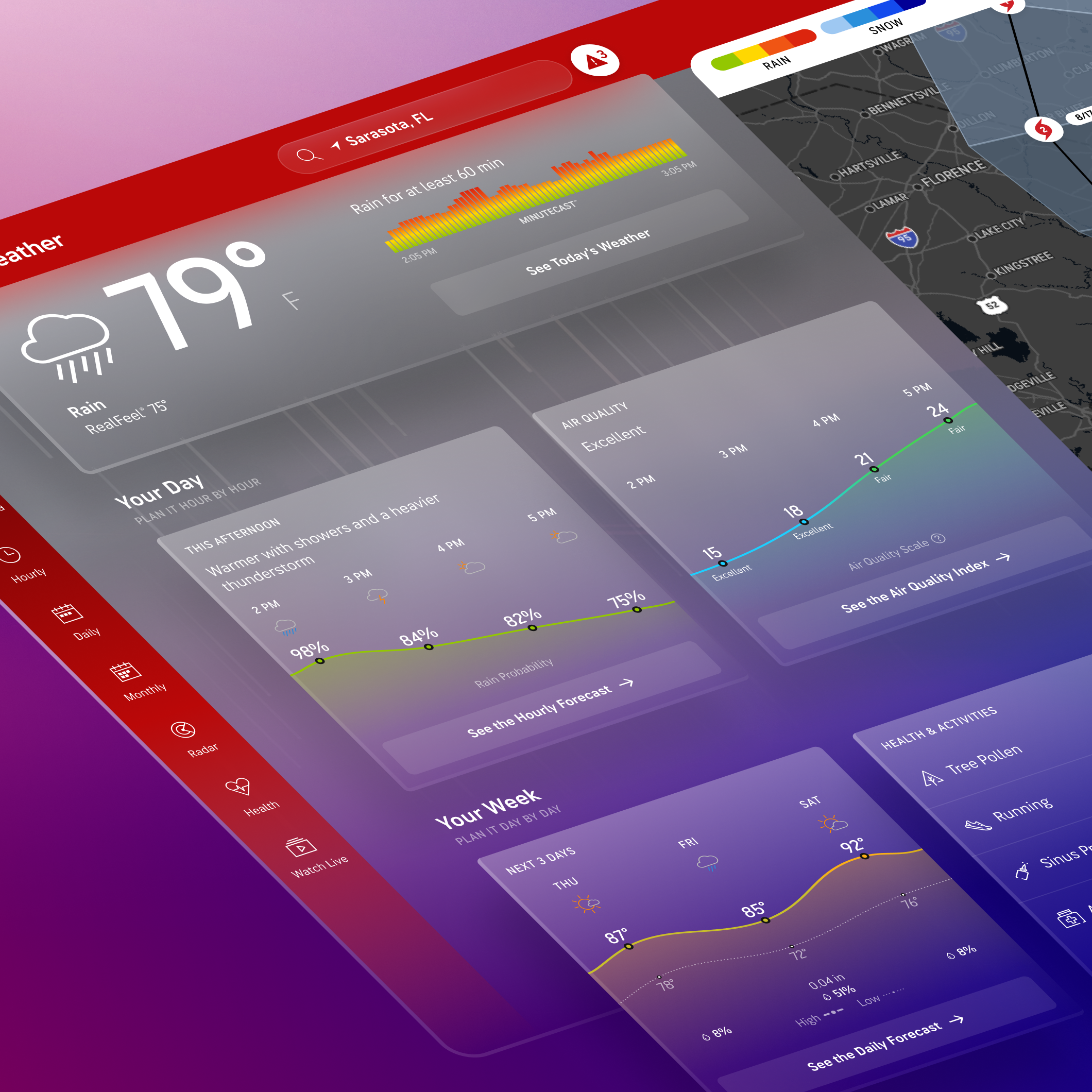
NEW HOURLY CHART
Scrollable hourly chart for users to easily see trends in data

SEVERE WEATHER ALERTS
Providing users with easy entry points into alerts

SUNRISE & SUNSET
Sunrise and sunset information available on the chart

MORE WEATHER DATA
Providing tabs for all weather data including wind, air quality, cloud cover, UV index, etc. We also include related map layers to each tab.

UPSELL
Upsell to subscribe inline with chart after 24 hours

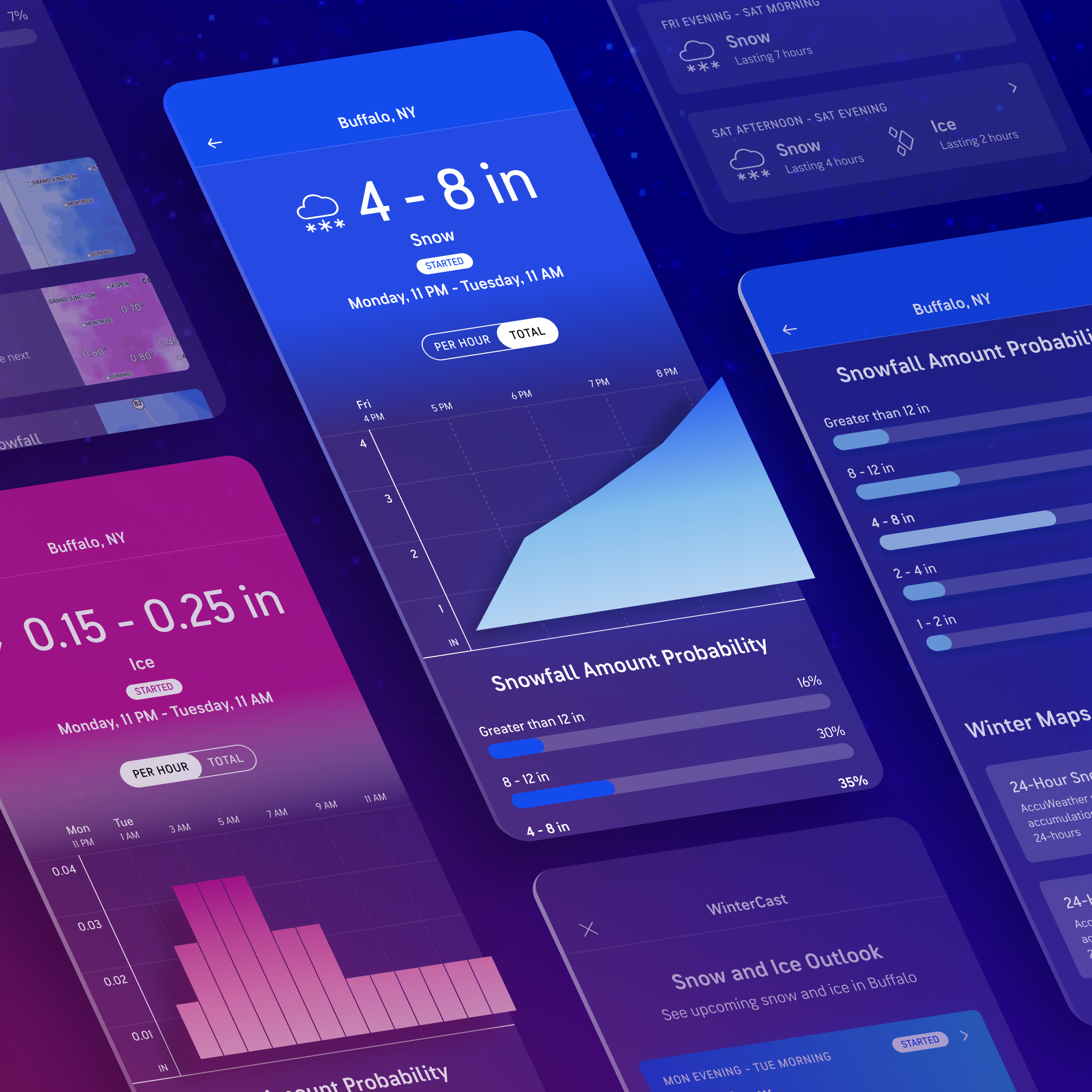
HURRICANE TRACKER
Alerts appear on hourly screen for Hurricane and WinterCast

NEW LIST VIEW
Revised list view to make it look more tappable