Project Description
Health + Activities
Providing users the ability to customize allergy, health, and activity data most important to them.

The Problem
Addressing the diverse health considerations and activity preferences of users posed a significant challenge. Customizing messages based on specific health symptoms seemed impossible amidst a plethora of activities on the web. With over 40 activities, prioritizing valuable indices was crucial. Additionally, the existing user experience was convoluted, hindering navigation to health & activity forecasts and resulting in poor awareness.
The Goal
CREATING BETTER AWARENESS AND FLEXIBILITY
Our primary aim was to make indices relevant and valuable for users while enhancing organization and discoverability. Flexibility was key; we needed a solution capable of seamlessly incorporating new indices without disrupting the user experience. Furthermore, our sales team sought a more engaging platform for sponsors, emphasizing the need for an attractive interface.
ELEVATING USER EXPERIENCE THROUGH PERSONALIZATION
Introducing customization into our app and premium offerings would allow users to favorite the heath and activity categories most relevant to their needs. Our hypothesis is that customization is a major driver in customer engagement because they feel like they have control over the information they are seeing. Allowing some sense of control for our app users will drive value for Premium+ offerings, because it not only includes exclusive information not available on the free version, but it also allows them control over their experience.
My Role
I led design efforts to introduce the app’s first customized forecasting experience and innovated what was once a weak area of our core weather experience. I did this by not only introducing customization, but also used data informed decisions to implement and highlight valuable key weather factors, safety tips, and data visualizations to help provide users with the necessary context and information to fully understand and trust the data and forecasts they are looking at.
The Results
- Premium+ Subscription Enhancement: Added substantial value to Premium+ subscriptions on the app, enriching the user experience for our premium users.
- Relevant Today Screen: Crafted a personalized Today screen, ensuring users receive information tailored to their needs and preferences, enhancing their engagement.
- Personalization Integration: Introduced a layer of personalization into the app, paving the way for innovative, user-centric ideas and experiences.
- Foundation for Sponsor-Friendly Experience: Laid the groundwork for a robust, sponsor-friendly platform, enhancing the visibility and appeal of health and activity forecasts for sponsors.
- Informed Content Strategy: Utilized research findings to inform content strategy, prioritizing specific topics based on user needs and preferences.
By addressing these challenges and achieving these milestones, we transformed our platform into a user-focused, personalized, and sponsor-friendly ecosystem, setting the stage for continued growth and innovation.
PROJECT DETAILS
Company: AccuWeather
My Role: UX + Lead Visual Designer
Platform: iOS, Android, Web
Team: UX, Product, Engineers, Meteorology
Programs: Figma (Design + Prototyping)
Research + Strategy
Gathered data from survey


Competitive research

Key Findings
- Allergies, arthritis pain and sinus headaches garner the most interest in the health category
- Gardening and driving resonated most in the leisure category
- Fishing and biking topped the sports category, but stargazing was also popular
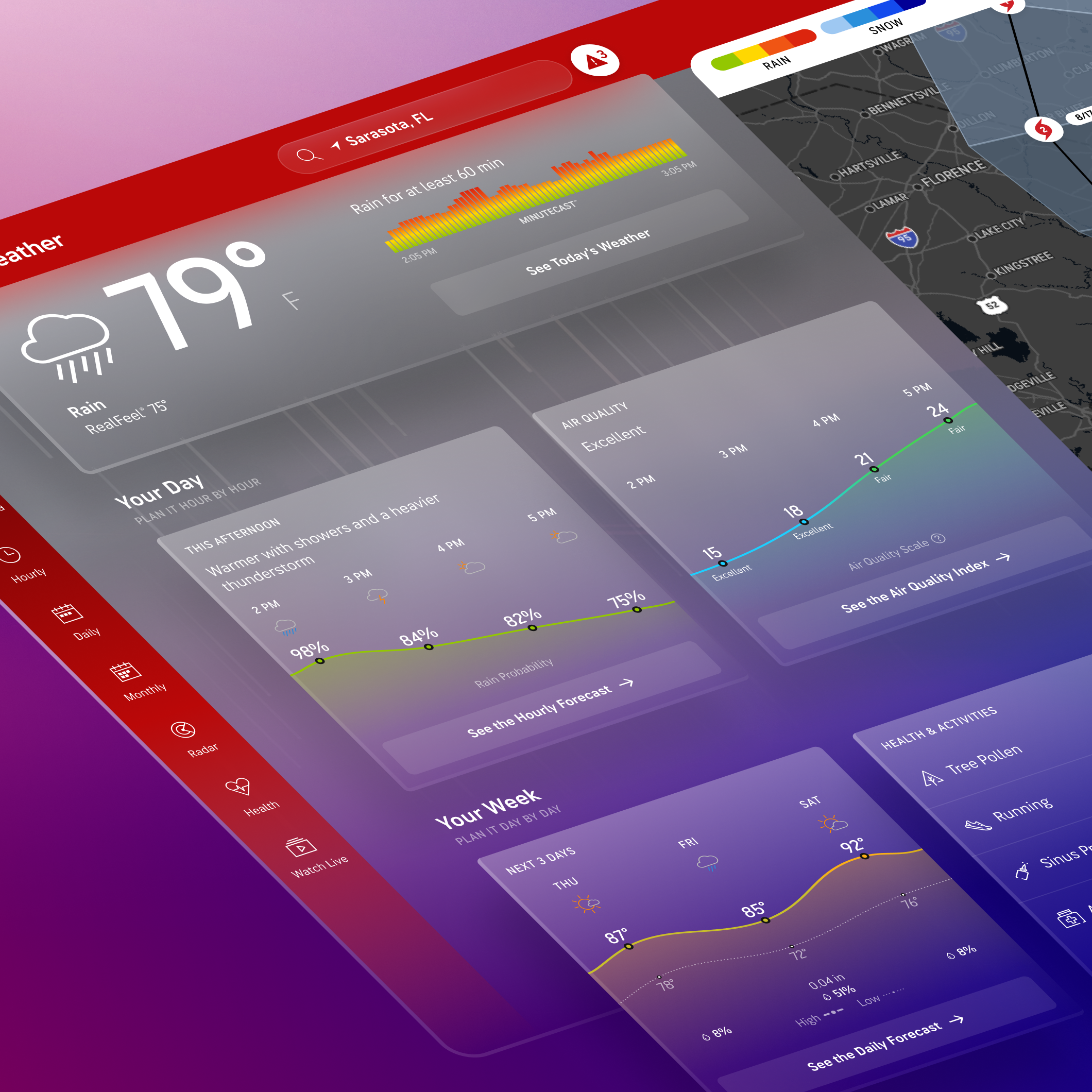
The App Experience
Analyzing the previous experience on app
The previous health and activities experience only showed allergy severity levels for the next 5 days. The different allergies were listed on the Today page of the app with a button to a weekly outlook for each allergy type. The challenge here is the lack of visibility and limited information to help retain users interest on a daily basis.
Recognizing this challenge, I collaborated closely with meteorology and backend teams. Together, we delved into the app’s API data and unearthed a wealth of untapped potential. By leveraging this data, we aimed to enrich the user experience substantially. Our goal was to provide users with comprehensive health insights and a plethora of data points, transforming their app interaction into a more informative and engaging journey. We also wanted to add health personalization as part of the Premium+ subscription to help boost our value proposition of the paid tiers on app.
Key takeaways from analysis
Expand available lifestyle and activity information in app to include Health group (in addition to the existing Allergy group)
Introduce the ability to add a limited number of favorite items from the available indexes
Focus on graphs/charts over text

Visual Design
ADD FAVORITES
Users can customize their experience

NEW LIFESTYLE TREATMENT
Users select the health and activities important to them

The Web Experience


Visual Design
DETAIL PAGE
Providing users with a daily chart, weather factors, and safety tips

NEW HUB PAGE
Houses all health and activities with ability to click through to detail pages

HEALTH HUB PAGE
Entry points into the detail page

REACTIONS
- Participants have found the Health & Activities experience to be “interesting” and even “unique.”
- Adjectives used to describe the overall experience: informative, useful, engaging, interesting, easy, organized, colorful, “life-saving”
- Immediately drawn to the H&A module when on the Today page.
- Very positive reactions to the Index Detail page
- Appreciated the weekly outlook chart and safety tip recommendations
NAVIGATION
From Today page to Index Detail page
- Participants easily found their way to an Index Detail page and expected that they will be provided with more information upon click of an index card.
- However, some mobile participants did not feel the need to see more details as they were content with what they saw on the Today page.
- Also, few mobile participants didn’t realize the index cards were tappable until they were instructed to tap one.
- Many participants noticed “See All” CTA and some wanted to click it to see the full list (meaning they understood the intention of the CTA)
Navigating from one health detail page to another
- The majority of desktop participants navigated to another page by clicking a card within the “Related Indices” row.
From Index Detail page to Hub page
- The majority of participants attempted to navigate through the subnav, by clicking “Health & Activities.”
- There were few who went back to the Today page went to click the “See All” CTA within the H&A module.
- Some participants went to the Related Indices row to look for “See All” CTA.
- Recommendation: To add “See All” CTA to the top right corner of the Related Indices row to match the Today page’s Health & Activities section.
- Desktop participants noticed and interacted more with the dropdown menu and the graph detail popups than mobile participants did.
SCROLLING BEHAVIOR
- All participants have scrolled to the bottom of the pages but this may not reflect their real-life behavior.
- Many found the ad banners to be too big, but it did not stop them from scrolling.
- While all participants (especially the mobile participants) found the horizontal scrolling easy enough (no one needed a direction on how to scroll/swipe), a couple desktop users and one mobile user did not like having to scroll horizontally, especially on the Hub page.
CONTENT PREFERENCE
- Health-related indices spiked the most interest.
- Caveat: We have screened for those with weather-related health issues.
- People did say they find activity-related indices interesting and useful, but a couple participants said it is more of a “nice to have” and that they “could probably judge on [their] own whether or not it is a good day to run.”
- Also, there were some doubts/confusion from the participants if we have different severity ratings among activity-related indices. (ex: “How can fishing be ideal when running is poor?”)