Project Description
CrossFit Scranton
BRAND IDENTITY // WEBSITE DESIGN

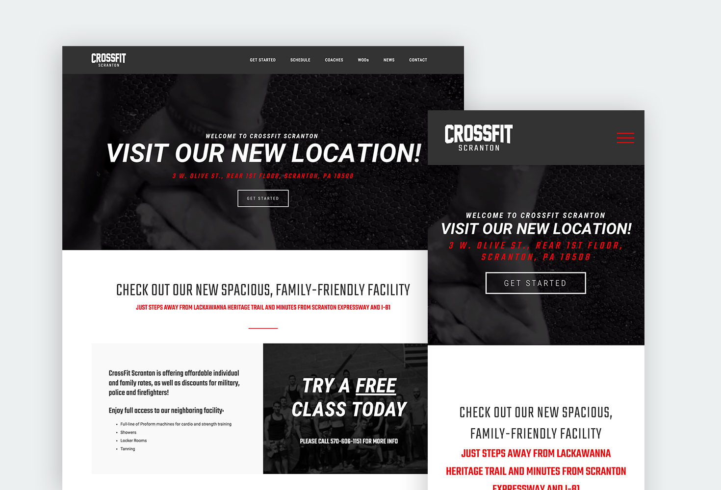
As a member of the CrossFit community, I wanted to do my part in spreading the word by designing a new modern website.
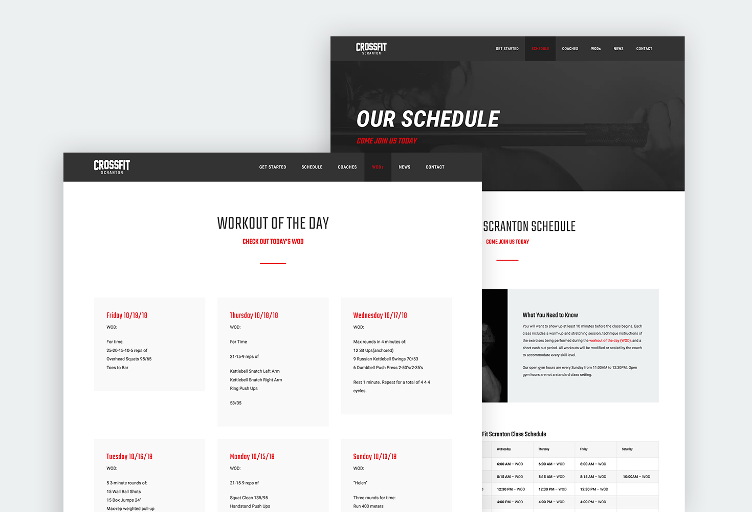
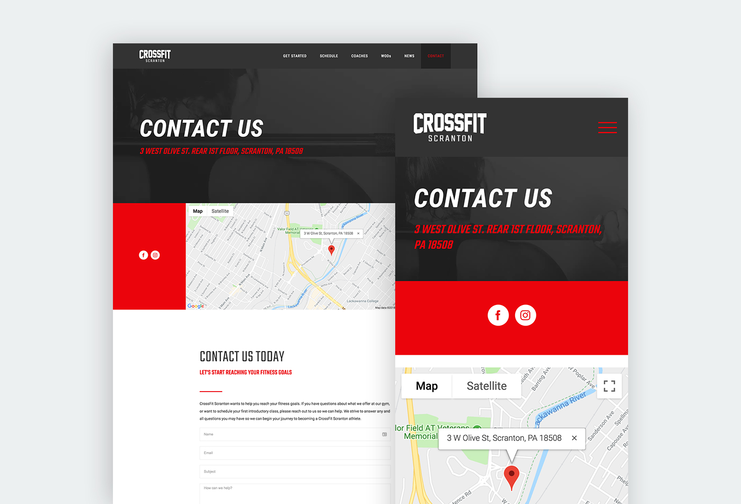
CrossFit Scranton was moving to a new location and wanted to get the word out. However, the website they had didn’t have an easy way to make regular updates and had an extremely outdated design. As a member of CrossFit Scranton, I wanted to help out and offered my services. Today, CrossFit Scranton has a modern, responsive, and informative website that helps current members and prospects to access the information they need. Administrators have the ability to upload pictures, WOD’s, and events.
MY ROLE
Myself and another member of the “box” communicated with the owners and established their needs and wants. From there, we research and strategized to create a brand identity and responsive website that demonstrated a modern, edgy design that would attract customers in the fitness marketplace. I gathered as much information about CrossFit as I possibly could, and wrote all the content for the website. I applied my skills in information architecture to ensure the navigation and flow of the content was seamless and easy to read.
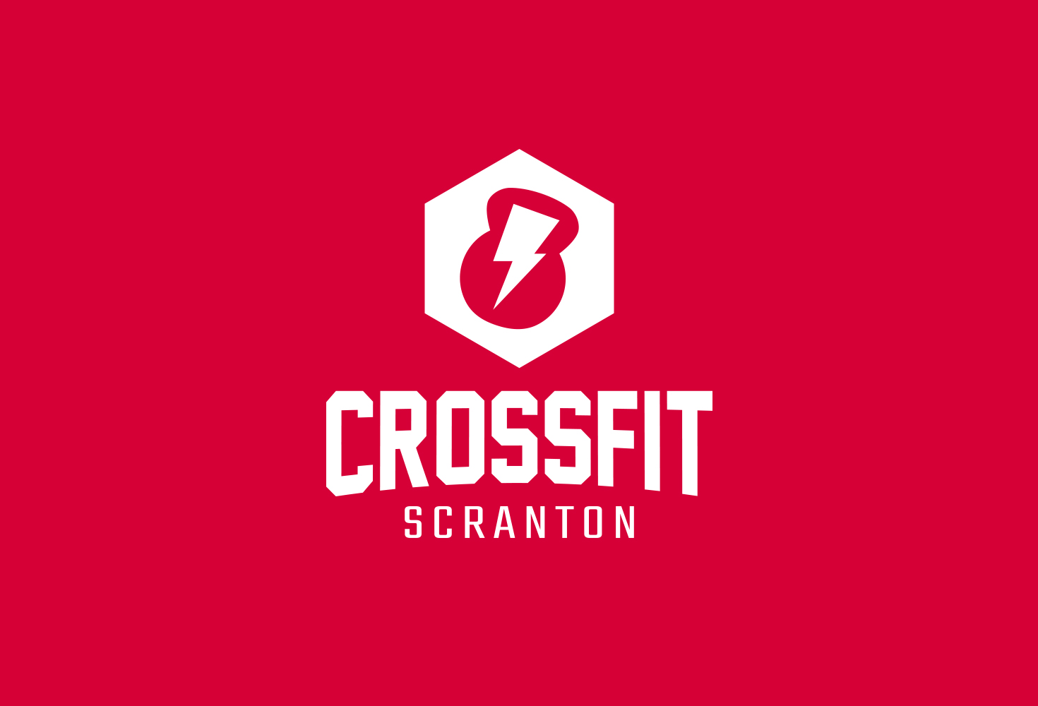
BRAND IDENTITY
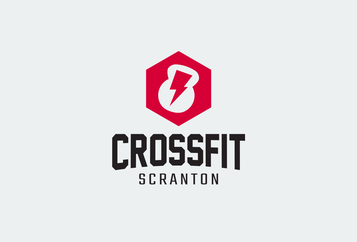
Kettlebells… The lifeblood of any CrossFit gym. Although it may be overdone in the fitness world, I felt this iconic weight was absolutely necessary for the logo design. I played on Scranton’s slogan “The Electric City” by incorporating a lightning bolt into the weight to give it a sporty, high-intensity look.
